
How to Improve the Readability of a Blog Post in 15 Minutes

Thu
AI SEO Specialist, Full Stack Developer

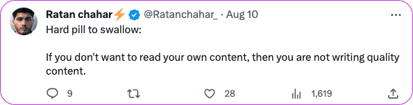
Readability is not about making a blog post basic. It is about reducing the effort it takes to understand the point, follow the structure, and decide what to do next.
If a reader has to fight through long paragraphs, vague headings, heavy sentences, or cluttered formatting, the problem is not only "writing style." The page is harder to scan, harder to trust, and harder to quote or summarize. In my experience, readability problems rarely come from one bad sentence. They usually come from a dozen small points of friction that make the reader work harder than they expected to.
TL;DR: The Fastest Way to Improve Blog Readability
To improve the readability of a blog post, start with the parts readers notice first: the opening, headings, paragraph length, sentence clarity, and visual structure. Then run one final editing pass for grammar, tone, and flow.
Here is the quick version. If I only had 15 minutes, I would not start by hunting for perfect synonyms. I would fix the route through the article first.
| Fix | What to do | Why it works |
|---|---|---|
| Lead with the answer | Give the main takeaway in the first few paragraphs | Readers can tell whether the post will help them |
| Shorten paragraphs | Keep most paragraphs to 1-3 sentences | The page feels easier to scan, especially on mobile |
| Make headings specific | Replace vague headings with useful promises | Readers can jump to the section they need |
| Cut sentence friction | Remove filler, jargon, and tangled clauses | The idea becomes easier to understand the first time |
| Add structure | Use bullets, tables, examples, and visuals where they clarify | The article becomes easier to skim and reference |
| Edit once aloud | Read the post aloud and fix every stumble | Awkward rhythm becomes obvious fast |
If you are starting from a blank page, a blog post generator can help you get a draft down. But readability comes from the edit, not the first draft.
The 15-Minute Blog Readability Audit
You do not need to rewrite the whole article first. I would start with a timed pass like this:
| 15-minute pass | Do this | Done when… |
|---|---|---|
| Minutes 1–3 | Fix the opening promise | Reader knows the job immediately |
| Minutes 4–8 | Split paragraphs + tighten sentences | One idea per short block |
| Minutes 9–12 | Make headings a map | Skimming answers “what’s here?” |
| Minutes 13–15 | Cut jargon, check CTA | A teammate can finish without re-reading |
Readability is not dumbing down. It is removing friction so the useful parts survive a scan.
How to Format Blog Posts in 5 Minutes (Boost SEO + Readability)
| Time | Check | Practical edit |
|---|---|---|
| 3 minutes | Intro | Add the direct answer, remove slow throat-clearing, and make the promise clear |
| 3 minutes | Headings | Rewrite each heading so it tells the reader what the section actually covers |
| 3 minutes | Paragraphs | Split dense blocks and move the main point to the first sentence |
| 3 minutes | Sentences | Shorten long lines, replace jargon, and cut repeated ideas |
| 3 minutes | Formatting | Add bullets, tables, examples, images, and white space only where they help |
This sequence matters. If the structure is unclear, polishing individual sentences will not fix the article. I have seen drafts get noticeably better after the intro and headings were cleaned up, even before the sentence-level edit started. Fix the path first, then clean up the wording.
1. Match the Reading Level to the Audience
The best readability level depends on who the post is for. A beginner guide should not read like a technical manual. A specialist article can use more precise terms, but it still needs clear structure.
For general blog content, a Flesch Reading Ease score around 60-70 is often a useful warning light. It usually means the copy is accessible without being childish. But do not treat the score as the goal. I am more interested in the rereading test: can the intended reader understand the point without going back over the paragraph?
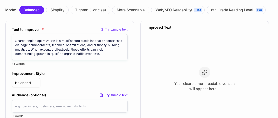
That is why I would use a readability improver as a diagnostic tool, not as the editor in charge. Let it flag long sentences, dense paragraphs, passive phrasing, and hard-to-read sections. Then decide which edits actually improve the post.
2. Fix the Opening Before Anything Else
The first few paragraphs should answer three questions:
- What problem is this post solving?
- What will the reader be able to do after reading it?
- Why should they trust this page instead of bouncing back to search?
Many blog posts lose readers because the introduction explains the topic for too long before becoming useful. A better opening gives the answer, sets expectations, and then moves into the workflow.
Personally, I am quick to cut opening paragraphs that only prove the topic matters. If someone searched for readability advice, they already know the post is hard to read. They need the first useful move.
For example:
| Weak opening | Better opening |
|---|---|
| "Readability is an important part of content marketing in today's digital landscape." | "If readers keep leaving your blog post, start by fixing paragraph length, headings, and sentence clarity. Those three edits usually improve readability faster than rewriting the whole article." |
The second version is more useful because it gives the reader a starting point immediately.
3. Make Headings Work Like a Map
Headings are not decoration. They are navigation.
People rarely read a blog post from top to bottom in a perfectly patient way. Nielsen Norman Group's long-running research on how users read on the web found that people often scan pages instead of reading every word. That means your headings need to carry real meaning.
Weak headings sound broad:
- "Use Better Formatting"
- "Improve Your Writing"
- "The Importance of Visuals"
Stronger headings tell the reader what they will get:
- "Split Long Paragraphs Before You Edit Sentences"
- "Replace Jargon With Words Your Reader Already Uses"
- "Use Visuals Only When They Explain Something Faster Than Text"
If the heading would make sense on any article in your niche, it is probably too generic.
The test I like is blunt: could the reader understand the article's argument by scanning only the headings? If not, the headings are probably labels, not a map.
4. Split Paragraphs So the Main Point Surfaces
Dense paragraphs are the fastest way to make a useful post feel difficult.
For most blog posts, 1-3 sentence paragraphs are enough. That does not mean every paragraph has to be short. It means each paragraph should have one job.
Use this test:
- If the paragraph has two separate points, split it.
- If the main point appears in the middle, move it to the first sentence.
- If the paragraph starts with setup but ends with the useful idea, cut the setup.
This is especially important on mobile, where a paragraph that looks normal on desktop can become a wall of text.
I tend to be more aggressive about paragraph breaks than many style guides suggest. On a blog, white space is not laziness. It is part of the reading experience.
5. Shorten Sentences Without Flattening the Voice
Short sentences help, but readable writing is not just a series of tiny sentences. The real problem is sentence friction: too many clauses, vague nouns, filler words, and ideas stacked in the wrong order.
Here is a simple way to edit a hard sentence:
| Before | After |
|---|---|
| "In order to effectively enhance the readability of your blog content, it is important to make sure that your sentences are not unnecessarily complex." | "To make your blog post easier to read, cut sentences that are longer or more complex than they need to be." |
The second version keeps the idea and removes the strain.
When a sentence still feels tangled, a sentence shortener can give you cleaner options. I would still review the result manually because overly short sentences can make a post sound choppy.
That last part matters. I do not like edits that make every sentence the same length. Readability needs rhythm, not just brevity.
6. Replace Jargon With Specific, Familiar Words
Jargon is not always wrong. Sometimes it is the correct term. The problem is using expert language when the reader needs plain meaning first.
If you need a technical term, define it quickly.
For example, do not write:
"Optimize syntactic complexity to improve content accessibility."
Write:
"Use simpler sentence structures so more readers can understand the post without slowing down."
A text simplifier can help identify phrases that sound more complicated than they need to be. The best edit is usually not the shortest possible wording. It is the wording your reader would naturally use.
There is a difference between simple and vague. I would rather keep one precise technical term and explain it clearly than replace it with soft wording that loses the point.
7. Use Formatting to Make the Article Scannable
Formatting should make the post easier to use, not just more colorful.
Use bullets when the reader needs a list. Use numbered steps when order matters. Use tables when comparison matters. Use bold text only when it helps the reader spot a key phrase.
My bias is to format only when the format earns its place. A table that clarifies a comparison is useful. A table that simply decorates three obvious points slows the reader down.
Avoid formatting tricks that add noise:
- Too much bold text
- All caps for emphasis
- Long lists where every item has the same weight
- Multiple links packed into one paragraph
- Images that break up text but do not explain anything
Google's guidance on helpful, reliable, people-first content is a useful reminder here: the page should be built for the reader's task, not just for search visibility.
8. Add Visuals Only When They Clarify the Point
Visuals can improve readability when they reduce effort. A screenshot can show an interface faster than a paragraph. A diagram can explain a process. A table can make options easier to compare.
Visuals do not help when they are generic filler.
This is where I am fairly strict. A weak visual can make an otherwise practical article feel padded. If the image does not teach, compare, prove, or clarify, it probably should not be there.
Use this quick rule:
| Visual type | Use it when |
|---|---|
| Screenshot | The reader needs to see an interface, example, or before/after layout |
| Table | The reader is comparing options, checks, steps, or criteria |
| Diagram | The reader needs to understand a workflow or relationship |
| Chart | The data is meaningful enough to visualize |
| Illustration | The image reinforces the idea without pretending to be evidence |
If you use AI-generated images, make them article-specific. Image generators for blogs are most useful when they help you create diagrams or explanatory visuals, not generic decoration.
Also write descriptive image text. The W3C's image accessibility tutorial explains when images need meaningful descriptions and when decorative images should be handled differently.
9. Keep the Tone Conversational, Not Casual by Accident
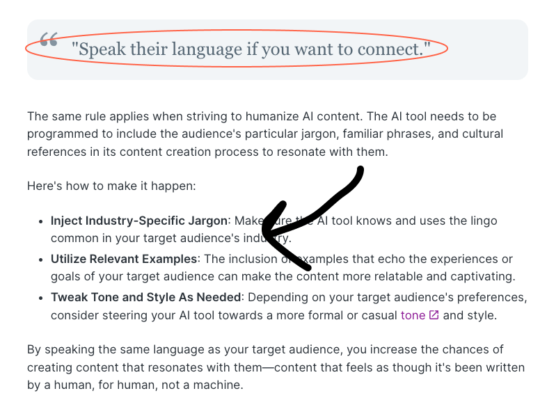
Conversational writing is easier to read because it sounds like a person explaining something clearly. But conversational does not mean loose, rambling, or careless.
A readable tone usually has these traits:
- It uses familiar words.
- It explains decisions, not just rules.
- It gives examples when advice could feel abstract.
- It avoids corporate filler.
- It sounds natural when read aloud.
If tone is the weak point, study the difference between formal, casual, persuasive, and instructional writing. The right tone depends on the reader and the job of the article, but the final test is simple: would your target reader believe a real person wrote this?
When I edit tone, I usually look for places where the article sounds like it is performing helpfulness instead of being helpful. Real conversational writing makes decisions for the reader. It does not just add friendly phrases around generic advice.
10. Edit for Active Voice, Grammar, and Flow
The final pass is where readability usually improves the most.
Start with active voice. Passive voice is not always wrong, but it often hides the actor and makes the sentence heavier.
| Passive or heavy | Clearer |
|---|---|
| "The article was improved by removing unnecessary words." | "We improved the article by removing unnecessary words." |
| "A readability review should be completed before publishing." | "Review readability before you publish." |
A passive-to-active voice converter can help you spot sentences that need attention. Then use a grammar checker to catch errors that make the post feel less trustworthy.
I would not stop at grammar, though. A clean sentence can still be boring, vague, or repetitive. If the post was generated with AI, run a final human pass for specificity, rhythm, and lived-in judgment. An AI text editor can help with larger rewrites, but adding a human touch to AI-generated content still means fixing dull examples, repeated phrasing, and claims that sound confident without saying much.
This is the pass where I am most willing to be opinionated. Grammar tools can make writing correct, but they cannot always tell whether a paragraph has earned the reader's attention.
11. Make the Post Easy for AI Search to Summarize
Readable content is easier for people to use, and it is also easier for AI systems to extract.
That does not mean stuffing the page with definitions. I have found that the better approach is almost boring: clean answer blocks, explicit steps, descriptive headings, and examples that can stand alone.
For AI Search and featured-summary visibility, add:
- A direct answer near the top
- A short checklist or table early in the article
- Clear definitions where the topic needs them
- Step-by-step sections with descriptive headings
- Examples that show the difference between weak and strong writing
- Source-backed claims where evidence matters
If you are writing the post from scratch, start with a clear outline before drafting. Writing a blog post gets much easier when the search intent, section order, and examples are clear before you worry about sentence-level polish.
12. Use This Final Readability Checklist Before Publishing
Before you publish, run through this checklist:
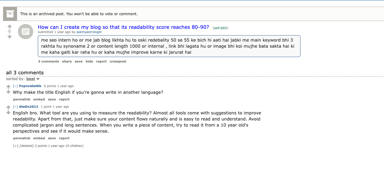
Score-chasing can miss the real issue. A post with the "right" keyword count, links, image, and word count can still feel hard to read if the flow, wording, and sentence length are wrong. I would rather publish a slightly imperfect score with a clean reading experience than a technically optimized post that feels like work.
- Does the intro answer the reader's question quickly?
- Can someone scan the headings and understand the article path?
- Are most paragraphs short enough to read comfortably on mobile?
- Did you cut filler phrases and repeated ideas?
- Are technical terms explained the first time they appear?
- Do bullets, tables, and visuals make the article easier to use?
- Are links natural, useful, and not packed into one paragraph?
- Are images compressed, relevant, and described clearly?
- Did you read the post aloud at least once?
- Did you check grammar, spelling, and formatting consistency?
A broader blog post editing checklist can help you review readability alongside structure, SEO metadata, accuracy, and internal links. Readability is one part of publishing quality, but it touches almost everything else.
Final Takeaway
The fastest way to improve blog readability is to reduce effort for the reader.
Start with the opening. Make headings specific. Split dense paragraphs. Shorten hard sentences. Replace jargon. Add structure where it helps. Then read the post aloud and fix every place where the rhythm breaks.
Small edits compound quickly. My rule is simple: if a paragraph makes the reader pause for the wrong reason, fix it. A post that is easier to read is easier to trust, easier to share, easier to summarize, and more useful for the person who clicked in the first place.